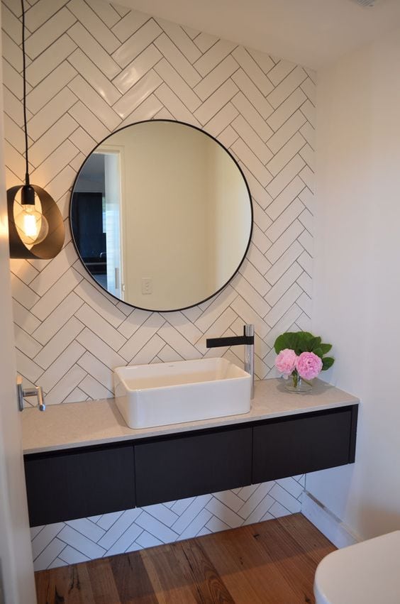
You have finally decided that you are going to remodel your bathroom using white subway tiles. After months of researching and saving all your favorite "looks" to your Bathroom Remodel board on Pinterest, you have decided to remodel your bathroom you are going to use 3" x 6", white subway tiles.
You get to the local hardware store and purchase the tiles to come back and your contractor then asks "how would you like the tiles placed?" You think, "Ugh, I just can't deal with another decision, how should I place these subway tiles for my space?" Well, Roomhints has written this article just for you. To help you understand what white subway tile design option is best for you, your bathroom remodel and why?
1. Classic Horizontal: white subway tiles line up perfectly
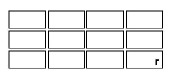
Look #1, the classic horizontal white subway tile look. If you like clean lines and an orderly look, this is the perfect white subway tile style for your bathroom. This look is VERY popular though, so you won't be impressing your friends with this design...but that said, it's easy and fool proof. If you are looking for an easy and affordable option, this is it.
Note in the below image the tiles are 3" x 12" white subway tiles. This longer tile create a more modern and sophisticated look. However, since this tile size is not as common, they can be a bit more expensive than the regular 3" x 6" tile.
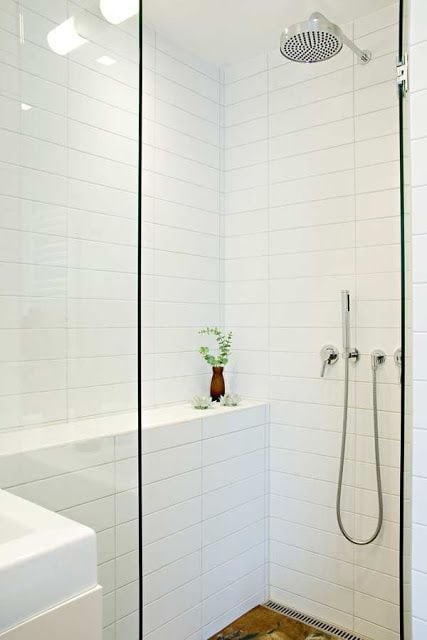
2. Classic Vertical: white subway tiles line up vertically
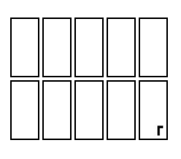
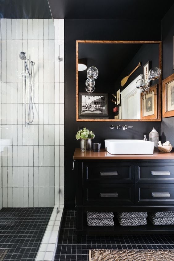
Look #2, the classical vertical white subway tile design. Similar to look #1, this design is easy, affordable and fast to do. Do the first line across before starting on the next line to ensure that the tiles line up perfectly.
This look also is timeless, straight up and down likely won't go out of style anytime soon. If you are unsure how long you will live in your place or are looking for a design that would help to sell your place - go with this look.
Note, the tiles in the picture below are 3" x 12" tiles.
(image from Brit + Co)
3. Offset Vertical: offset white subway tiles
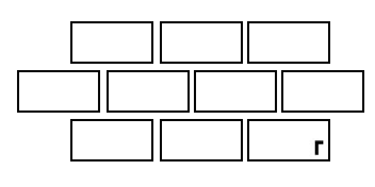
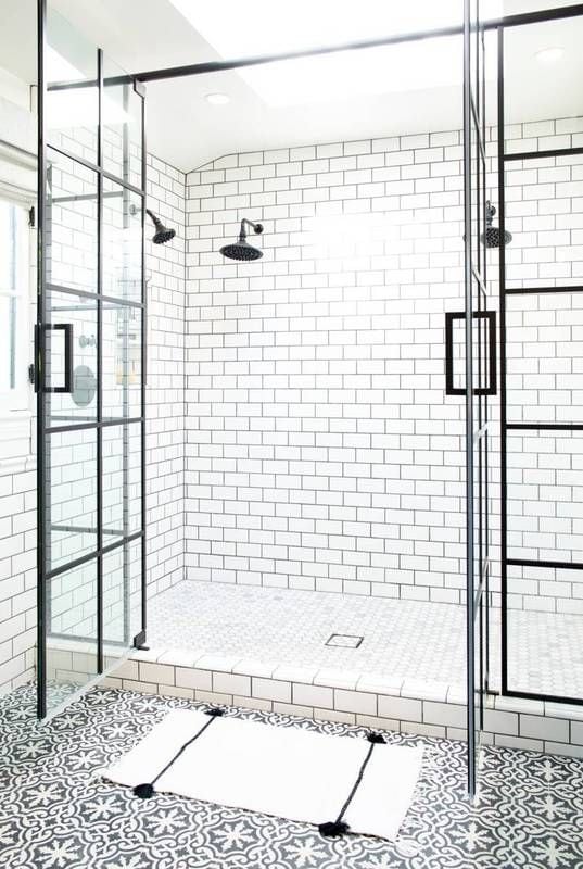
Look #3, the offset vertical white subway tile. This white subway tile look is super on trend right now. Especially with dark black grout. When creating this look make sure to measure the second line to ensure that the tile is lined up exactly halfway between the tile above. Once the first two lines have been created it is easy to carry out the pattern on the rest of the wall.
Dark grout or white grout works great with this look. Dark grout is easy to keep looking clean vs. white grout that overtime will get dirty. But if you do not have dark or black accents in your bathroom, stick with white grout.
(Image from Lifestyle-La)
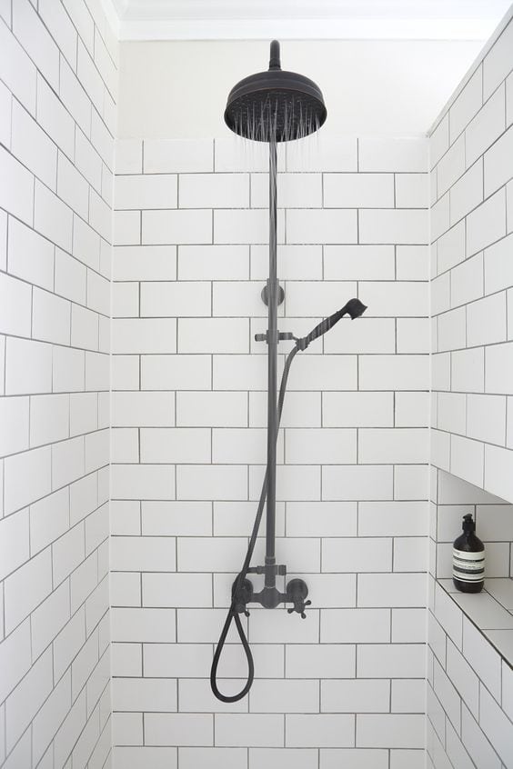
4. Diagonal: tiles line up perfectly
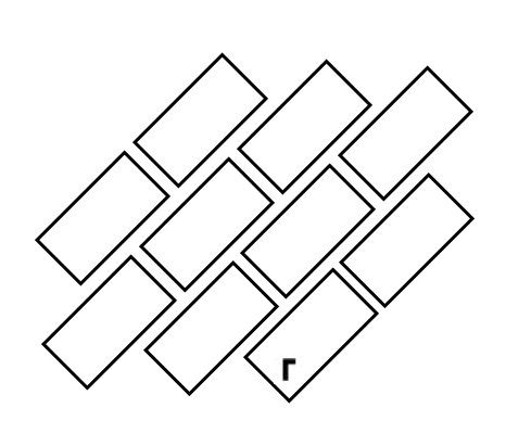
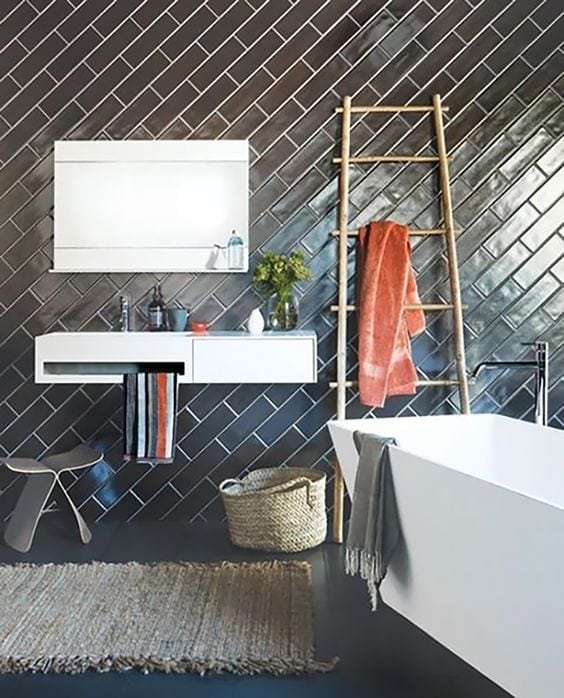
Look #4, the diagonal white subway tile look. If you are looking for a look that is a bit more funky and not as common, go with the diagonal subway tile look. Now these are not white subway tiles, but they could very well be. Whether you choose white or black, this design works. This design is harder to achieve than the above as you have to make sure the angle is correct. Start from the corner and work your way across the wall. Work on the diagonal to lay the tiles.
(image from A Beautiful Mess)
5. Offset Vertical: tiles line up perfectly
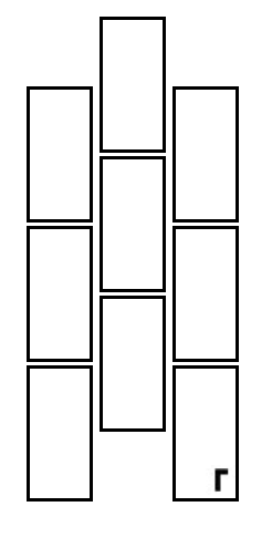
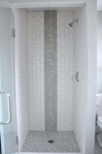
Look #5, the offset vertical white subway tile look. For this look follow the same guidelines as for the horizontal offset look. Make sure the first two vertical lines line up perfectly, each tile is halfway in between the tile next to it. Once you have this carry out with the rest of the design on the wall.
Vertical lines always make a space look taller so if you are looking to create the appearance of a super tall bathroom, I would suggest this look.
(image from HGTV)
(image from Lindsay & Andrew)
6. Herringbone Vertical: criss cross your tiles.
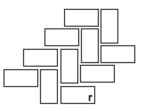
Look #6, the herringbone vertical white subway tile look. Of all the styles, this one is the hardest one to achieve.... but don't let that scare you, it's totally doable. Be patient and take your time laying out the tiles. This look gives an added element of elegance to your space.
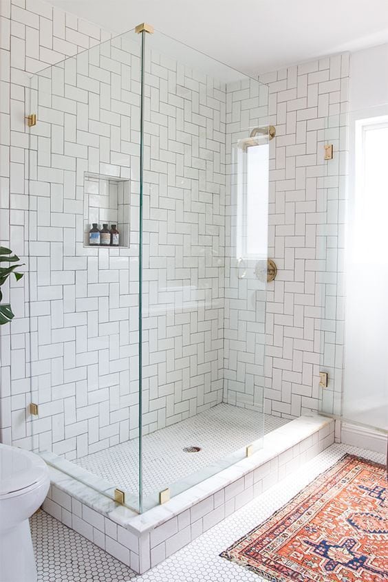
Also, as seen in this picture below - you don't have to stick with this herringbone pattern for all walls. The bottom of the shower has a straight pattern using the extra pieces.
] '
'
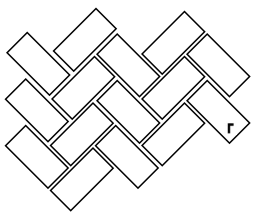
7. Herringbone Horizontal: criss cross style #2
Look #7, the herringbone horizontal white subway tile look. Same technique as above but just horizontal instead of vertical. It's easiest if you add the first vertical "V" line down and then fill in the tiles from there. Make sure to space your tiles evenly so that you have equal amount of grout. Again, this look gives a bit of elegance to the space. It's fabulous if you want something different.
8. Straight Horizontal Corner tiles: tiles meet horizontally at the corner.
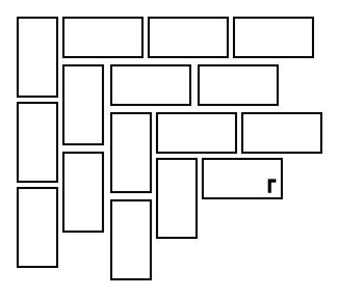
Look #8, the straight horizontal corner white subway tile look. For this white subway tile look start with the corner. Sounds obvious but you would not believe how many people mix this up! Then work your way down. This look is very easy to achieve and is more interesting that just the straight horizontal look. Make sure that each of the corners line up in a diagonal straight line. It's okay if you need to lay the tiles out first on the floor to understand how to master this look.
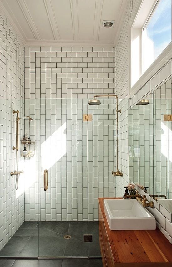
(image from Liz Marie Blog)
9. Square: Square shape tiles
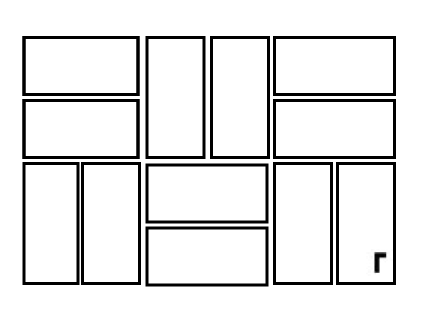
Look #9, the square white subway tile look. For a more minimal but yet still a bit funky look, go with the white subway tile, square shape. Make sure to keep an eye out that the horizontal and vertical tiles line up perfectly. There should be one even line of grout all the way across. One trick with this look is to draw lines on the wall before placing the tiles. This way you have a guide as to where to place each tile. One you have the first line in place it will be easy to create the following lines. Start with the top and work your way down.
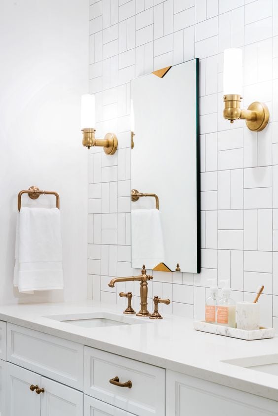
(Image from Caitlin Wilson)
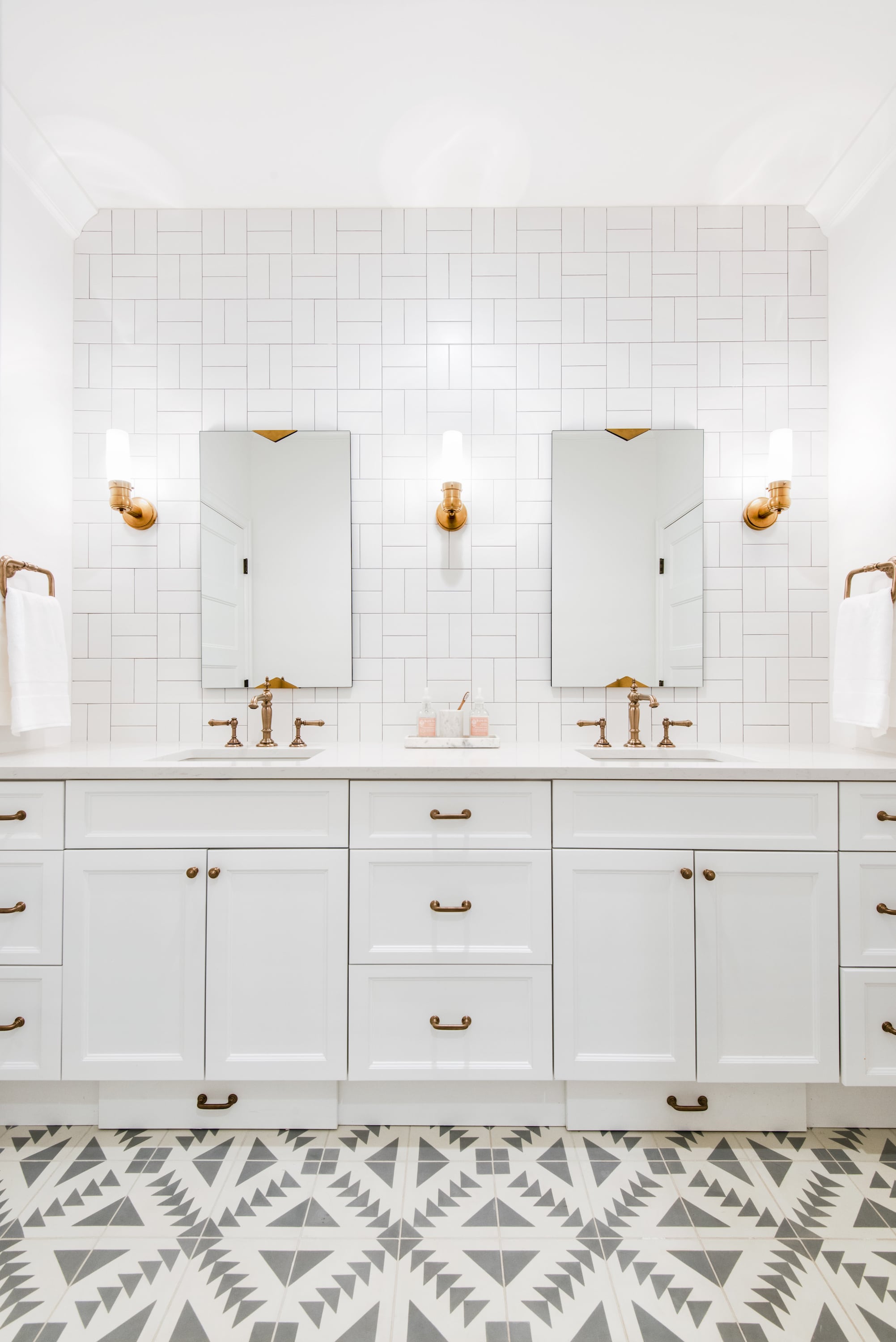
(image from Caitlin Wilson)
Bonus: Designer look - random placement

Lastly, the designer white subway tile look. If you are feeling a bit like you want to shake things up in your home and not have what everybody else has - this is the designer look. Uneven placement of tiles. There is no pattern to the placement of these tiles. If you are going to try this look, use 6" x 3" tiles and 100% lie out the design on the floor before placing it on the wall. One you have the first few vertical lines in place it will be easy to carry the design across. This will definitely impress all your guests!
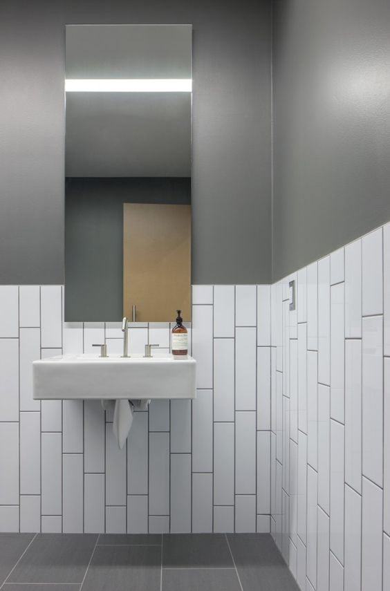
(Image from ArchDaily)
For more bathroom remodeling ideas check out these stunning pink tile bathroom hints from designer Jennifer Talbot.

